
Minimalism is mostly associated with the art sector, for instance literature,music and painting. Web designers use the term to refer to those things that makes a website functional. Most web designers use the art of minimalism in order to make obscure instructions easy to capture or understand.
When it comes to minimalism, numerous number of people think it is easier probably because it is seen as a very simple art, which is totally not the case. Web design is characterised by extensive charming typography, incredible visual, space and the general concentration on the content.
There is no doubt that minimalism is becoming a renowned art in our world today. This is because it is very consistent with majority of the web designs that are used today. Based on the experiences of using and creating the modern day websites, the articles clearly comes up with several techniques that you can use to design the best website for your blog. If you are running a business website then ensuring that you are operating a proper web design is key for higher business performances.
You need to ensure that your website is properly designed such that the various users can easily access information from the site without any complications. The procedures required in accessing the various content from your website should be simple for all users. This is key to ensure that the various users takes a shorter time getting the intended message published on your site and that they can also pose any questions related to the products and services delivered. We have highlighted some of the top ways to properly design a company website to suit the user's needs.
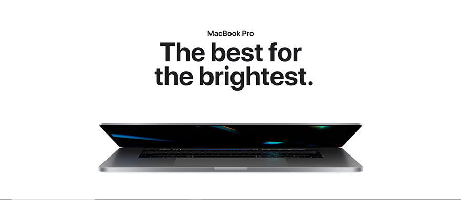
Large and Bright Photography
In minimalist design, the most conspicuous form of art is the hero header and the hero image which are characterised by slider or image placed adjacent to the top of the scroll. This will definitely restore the simplistic feature of a minimal design while at the same time the world of emotional connection and atmospheric setting.
The most important aspect when choosing a photo is to ensure that all the graphic minimalist elements are available in the photograph. These graphics elements include things like photos with spacious negative space, expansive skies or even empty white walls.
Negative Space
This is by far the principal feature of a minimalist design. Negative space makes it very easy to capture the user's attention, especially if you use black, white or even darker backgrounds.
Additionally, negative space helps you to surpass the design from overpowering the user emotionally. This is made possible by the fact that it helps in exhaustive planning of the elements.
Another amazing thing about the negative space is that it generates a sense of luxury to the user. Most companies, especially the architectural firms want to their pages to appear refined. Using a brighter background and a little bit of simple navigation will absolutely do the magic.
Supersize Typography
For your website to be meaningful or sensible, words must be present. The choice of a good typography will automatically make you hit the mark.

Based on the minimal framework that you have, an impeccable typography should be either pleasant, sharp or even custom. Examples of appealing typographies that you can use include bold styles and letter forms, i. e typeface for headers and neutral typeface for the rest of the content.
A supersize typography will definitely be appealing to your users.
Appealing Contrast
The trademark of minimalism design lies in the contrast that you use as a designer. You need to generate a contrast that is consistent with shape, scale, location and colour.

Image: © PureSolution - stock.adobe.com
Apart from capturing your users attention, contrast also creates a visual presentation. White background is the perfect choice to create a beautiful contrast.
Visual Harmony
The important ingredients for your good visual presentation include alignment, a rigid grid and visual balance. A strong grid helps you set up elements in a purposeful manner.

Image: © PureSolution - stock.adobe.com
Basically, elements on the grid can be aligned anywhere not necessarily at the center. Designing a proper website is very essential to attracting more traffic to your website and improving the company performances as well. The elements discussed here in are this key to help you properly design your website.